First logo modification after 13 years

More than a decade after it adopted its current logo, Bank Windhoek announced this week it has tinkered with the now well-known brand icon, making small adjustments to align the bank’s public image with the amazing possibilities it sees in its future.
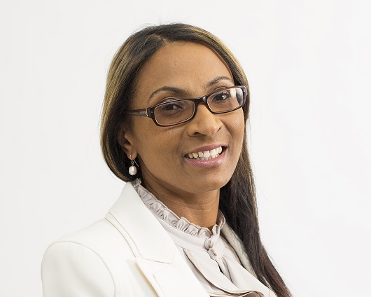
The bank’s Managing Director, Baronice Hans, said their rich history and legacy give them the legitimacy and credibility to navigate a better future for themselves and all their stakeholders. “Our brand refresh is a celebration of the exciting journey we have walked with our customers and are entering into in terms of the future,” she said.
Calling it an evolution of its brand, the bank said the new look builds on a great platform, showcasing the amazing possibilities of what the future holds for them and their customers.
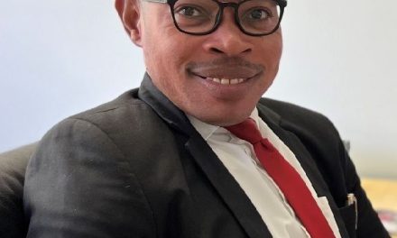
Jacquiline Pack, Executive Officer: Marketing and Corporate Communications Services explained that the changes to their brand are aligned to a progressive, innovative look, showing that they have the passion to make a difference in peoples’ lives. The smoother edges and cleaner lines in the new-look logo encapsulates this same message of commitment and confidence.
“We have removed the standard blocked icon to free up the logo aligning it to the overall Capricorn Group brand strategy” stated Pack adding that customers will enjoy a new world-class experience with the refreshed look which also applies to the bank’s electronic platforms, i.e. the bank’s mobile app, its iBank service, and the new website which will be launched next month.
Emphasising the power of their motto “Together we do better”, the bank said relationships have always been at the core of their business, ensuring the customer is at the centre.


