


This may turn out to be the con of the century
It is difficult to find the words to describe a rational mind’s assessment of what is going on in the world. There is a measurable disjunct between what is observed and what is propaganda.
When I look at the Covid data on the Worldometer site, what I see is a classic asymptotic graph, meaning the value on the Y-axis will continue to rise at an exponential rate but never actually form a tangent with the vertical line on the X-axis, for whatever value I chose to compare.
This is in the graph for new infections, and lately it is accompanied by a bar chart indicating daily values. The infection and death statistics are also displayed in logarithmic graphs which in my opinion are useless because it only shows the daily growth relative to a factor of ten.
But let me stick to the easier linear graph. If the information is correct and if the data is reliable, it means that it is theoretically possible to determine that point in future where all 7 billion of us would have contracted the SARS-CoV-2 virus which is its scientific designation since February this year.
It does not mean that at this future point where a tangent should be formed, that we are all dead, for this is the first mind-boggling fact, – only 5.4% of those infected has died of the disease so far. And that 5.4% may be as viscose as a lubricant given under-reporting in some jurisdictions and gross exaggerations in many others. But it remains true that the graph provides a basis to extrapolate Corona’s projected path.
Keep in mind that to date (and that is after the statistical spikes have started reverting to normal), only 0.0063% of the world’s population has died of Corona. That is just over six thousandths of one percent.
Trying to unravel the whole spaghetti bowl of baffling data and wild claims by diametrically opposed parties, I started digging in US health databases. After all, I have a high regard for US statistics, not only for their spread and coverage but also for their accuracy and timeliness.
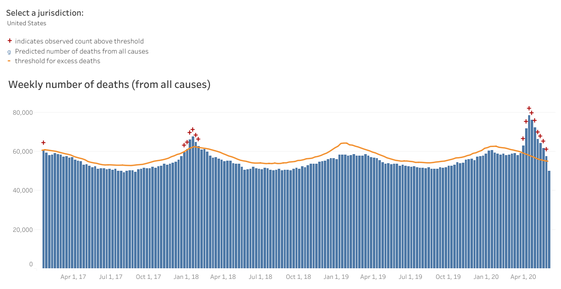
This is when I happened upon the bar chart which I used as the visual above, and reprinted below. Just as I expected, the Americans are on top of Corona, both statistically and medically. I advise every reader to go to the Centers for Disease Control and Prevention site and there click on any of the relevant dashboards. As usual, the methodology is explained, and it is sound, and the charts are interactive showing a lot of cadastral data when hovering; and you can even download entire datasets if you want to make your own calculations or draw your own graphs.
My prime motive was to find out how many more than usual people have died as a result of Corona. This is where the search started following an interesting trail. While ALL the jurisdictions I considered showed a large spike in so-called excess deaths from around the beginning of April, not all these deaths were attributed to the virus. But most baffling of all, the excess deaths soon returned to normal and by the end of May, both the USA and the UK posted below-average death rates for all causes.
Now I beg somebody, anybody who understands statistics better, to explain to me how the worldometer meter can continue to show an asymptotic curve while two countries with large infected pools, and very dependable statistics, show just the opposite.
From what I have learned this week, I stick to my earlier opinion that SARS-COV-2, the disease itself, is not the threat it is made out to be, but that the real threat is the lockdowns that occurred in the wake of the first infections.
Do not think that I am underplaying the importance of a worldwide pandemic, I am not, but this is looking less and less like a pandemic. What it looks like is an agenda driven by unknown actors with the intention to cause an economic meltdown, and what better way than exploiting ordinary people’s fear of death to force the entire world to a standstill. Work up a sufficiently strong psychosis, and everybody starts distrusting everybody else, in an attempt to avoid being affected by a disease that most probably is spreading across the globe just like all flu viruses every year.
What is hurting us is not sick people, but sick minds.


